Home » U++ Library support » U++ Widgets - General questions or Mixed problems » State of "button"
| Re: State of "button" [message #15563 is a reply to message #15500] |
Tue, 29 April 2008 10:17   |
 cbpporter
Messages: 1427
Registered: September 2007
|
Ultimate Contributor |
|
|
I centered the image in text in ToolButton. I've done this as default for both modes that have label. I hope I did not upset some pixel perfect layout of these elements that you had in mind, but I think that they are set up the same in toolbars. Tested in UWord too and looks the same. I don't think that default center is a problem since no one would like a button like this:
Here is the code:
void  ToolButton::Paint(Draw& w)
{
	LTIMING("ToolButton::Paint");
	paint_checked = checked;
	Size sz = GetSize();
	UPP::Image image = GetImage();
	Size isz = image.GetSize();
//	Ctrl *q = GetParent()->GetParent();
//	if(!q || !q->IsTransparent())
//		w.DrawRect(sz, checked && !HasMouse() ? Blend(SColorFace, SColorLight) : SColorFace);
	int li = IsEnabled() ? HasMouse() ? GetMouseLeft() ? CTRL_PRESSED
						                               : checked ? CTRL_HOTCHECKED : CTRL_HOT
				                       : checked ? CTRL_CHECKED : CTRL_NORMAL
					     : CTRL_DISABLED;
	ChPaint(w, sz, style->look[li]);
	Point off = style->offset[li];
	Point ip = (sz - isz) / 2 + off;
	Size tsz;
	if(kind != NOLABEL)
		tsz = GetTextSize(text, style->font);
	if(kind == BOTTOMLABEL) {
		ip.y  -= tsz.cy / 2 + 1;
		w.DrawText((sz.cx - tsz.cx) / 2 + off.x, ip.y + isz.cy + 2 + off.y, text, style->font, style->textcolor[li]);
	}
	if(kind == RIGHTLABEL) {
		ip.x -= tsz.cx / 2 + 2;
		w.DrawText(ip.x + isz.cx + 3 + off.x, (sz.cy - tsz.cy) / 2 + off.y, text, style->font, style->textcolor[li]);
	}
	UPP::Image img = CachedContrast(image, style->contrast[li]);
	if(!IsEnabled())
		img = DisabledImage(img);
	if(IsEnabled() && style->light[li])
		DrawHighlightImage(w, ip.x, ip.y, img, true);
	else
		w.DrawImage(ip.x, ip.y, img);
}
Also, some extra stuff for checking:
Bar::Item& ToolButton::Check(bool check)
{
	checked = check;
	Refresh();
	return *this;
}
ToolButton& Label(const char *text, int kind = ToolButton::RIGHTLABEL);
bool		IsChecked()				 { return checked; } // in header
I didn't use bool Get() since there is Radio too, and it would be ambiguous: does get return checked state or radio state? Right now they are the same, but this could change.
This about covers all there is to make ToolButton a viable ButtonOption replacement. It does not look that great checked with solid skin on Vista, but neither does ButtonOption, so I guess it's ok.
-
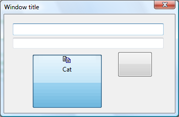
 Attachment: Button.png
(Size: 15.20KB, Downloaded 829 times)
|
|
|
|
 |
|
State of "button"
|
|
|
Re: State of "button"
|
|
|
Re: State of "button"
By: mrjt on Tue, 15 April 2008 10:48 |
|
|
Re: State of "button"
By: mirek on Wed, 16 April 2008 10:17 |
|
|
Re: State of "button"
|
|
|
Re: State of "button"
|
|
|
Re: State of "button"
By: mirek on Sat, 26 April 2008 09:59 |
|
|
Re: State of "button"
|
|
|
Re: State of "button"
|
|
|
Re: State of "button"
By: mirek on Tue, 29 April 2008 19:30 |
|
|
Re: State of "button"
|
|
|
Re: State of "button"
By: mirek on Mon, 16 March 2009 10:31 |
|
|
Re: State of "button"
By: mrjt on Mon, 16 March 2009 17:26 |
|
|
Re: State of "button"
|
|
|
Re: State of "button"
By: mirek on Thu, 19 March 2009 18:29 |
|
|
Re: State of "button"
|
|
|
Re: State of "button"
By: mirek on Thu, 19 March 2009 19:32 |
|
|
Re: State of "button"
|
|
|
Re: State of "button"
|
|
|
Re: State of "button"
By: mirek on Fri, 20 March 2009 21:02 |
|
|
Re: State of "button"
By: mirek on Thu, 19 March 2009 19:28 |
Goto Forum:
Current Time: Sun Jul 13 11:50:53 CEST 2025
Total time taken to generate the page: 0.05886 seconds
|


 Members
 Pages
Pages Help
Help Register
 Login
Login Home
Home


")
