Responsiveness
From Wikipedia's Responsive Web Design, it is an approach to web design that makes web pages render well on a variety of devices and window or screen sizes.
Following this concept, Responsive() method has been added to allow scatter plots to show similarly at different resolutions.
Two scenarios has been taken into account:
The same plot may be shown at different screen sizes: An application can be deployed to be used in different devices and screen resolutions.
The same plot may be shown in a screen and in a high resolution bitmap file: A plot that is properly viewed on screen, may be submitted to be published in a book or a journal. Publishers demand either vectorial or high resolution bitmaps (for example, 3000x3000 pixels)
However, letter font sizes, plot margins and line widths are defined in pixels.
To solve this drawback, Responsive() considers that all plot dimensions in pixels are applied to a 600x400 pixels reference size, and scales up or down all dimensions if control size is bigger or smaller.
For example, let's consider the same plot with different configurations:
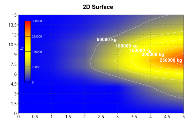
Size(600, 400), Responsive(false)
Plot looks right
|
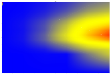
Size(6000, 4000), Responsive(false)
Size is so big that texts have vanished
|
|
|
|
|
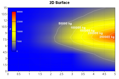
Size(600, 400), Responsive(true)
Plot looks right
|
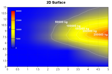
Size(6000, 4000), Responsive(true)
Although resolution is huge, texts and lines looks right and have not vanished.
|
|

|
|
|