|
|
|
Home » Community » Newbie corner » How do I make this graph?
|
|
|
|
|
|
|
|
| Re: How do I make this graph? [message #39835 is a reply to message #39829] |
Sun, 05 May 2013 15:57   |
 |
 koldo
koldo
Messages: 3454
Registered: August 2008
|
Senior Veteran |
|
|
Hello Jerson
I imagine the X and Y axis are rather "custom" so I propose you this to have exactly what you want:
This is the code:
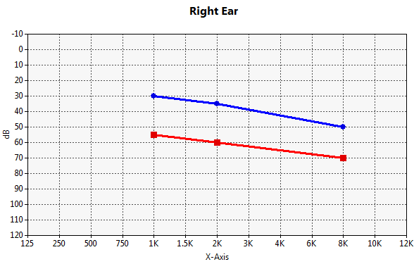
void MyClass::Init() {
	CtrlLayout(*this);
	HSizePos().VSizePos();

	scatter.SetRange(12, 130);
	scatter.SetXYMin(0, -120);
	scatter.SetMajorUnits(1, 10);
	scatter.ShowLegend(false);
	scatter.SetTitle("Right Ear").SetLabelX("X-Axis").SetLabelY("dB");
	scatter.SetPlotAreaLeftMargin(40).SetPlotAreaBottomMargin(40);

	s1 <<Pointf(4, -30) << Pointf(6, -35) << Pointf(10, -50);
	s2 <<Pointf(4, -55) << Pointf(6, -60) << Pointf(10, -70);

	scatter.AddSeries(s1);
	scatter.AddSeries(s2);

	scatter.cbModifFormatX = THISBACK(FormatX);
	scatter.cbModifFormatY = THISBACK(FormatY);
}

void MyClass::FormatX(String& s, int i, double d) {
	Vector<String> xLegend;
	xLegend << "125" << "250" << "500" << "750" << "1K" << "1.5K" << "2K" << "3K" << "4K" << "6K" << "8K" << "10K" << "12K";
	s = xLegend[i];
}

void MyClass::FormatY(String& s, int i, double d) {
	s = FormatDouble(-d, 0);
}
Have a nice Sunday! 
-
 Attachment: Image.png
(Size: 10.50KB, Downloaded 752 times)
Best regards
Iñaki
|
|
|
|
|
|
|
|
|
|
|
|
|
|
|
|
|
|
| Re: How do I make this graph? [message #39882 is a reply to message #39823] |
Thu, 09 May 2013 08:19 |
jerson
Messages: 202
Registered: June 2010
Location: Bombay, India
|
Experienced Member |

|
|
Thanks for all the help. I have been able to make a workable solution with the scatterctrl.
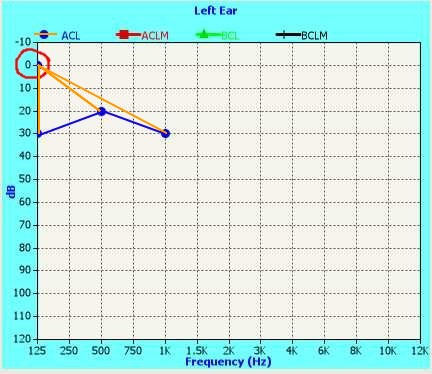
The blue line is what I wish to draw. It interpolates between data points that are presented to scatterctrl. However, the un-initialized vector data shows up at 0,0 This is not desirable because when I turn on .plot(), lines appear connecting 0,0 to each of the points in the series. It looks like cones falling from 0,0(orange lines)
I am setting the vector like this
Vector<Pointf> LeftSeries[4];
Since I have just 12 points on X axis, I enter the data like this
	Test.scaLeft.SetRange(12, 130).SetXYMin(0, -120);
	Test.scaLeft.SetMajorUnits(1, 10).ShowLegend(true);
	Test.scaLeft.SetLabelX("Frequency (Hz)").SetLabelY("dB");
	Test.scaLeft.cbModifFormatX = THISBACK(A2001_13::FormatX);
	Test.scaLeft.cbModifFormatY = THISBACK(A2001_13::FormatY);
	Test.scaLeft.AddSeries(LeftSeries[0]).Legend("ACL").NoPlot()
				.AddSeries(LeftSeries[1]).Legend("ACLM")
				.AddSeries(LeftSeries[2]).Legend("BCL")
				.AddSeries(LeftSeries[3]).Legend("BCLM");
and to plot the points
	double f = -1;

	Test.stText = AsString(Test.spnFrequency.GetIndex());
	LeftSeries[0].Set(Test.spnFrequency.GetIndex(), Pointf(Test.spnFrequency.GetIndex(),f*Test.spnIntensity));
	Test.scaLeft.Refresh();
Test is a <TopWindow>, others are EditIntSpin while spnFrequency is a droplist
The user can enter any point (not necessarily in a sequence of X) and the graph would interpolate it.
Question is, can this be done?
Best regards
Jerson
|
|
|
|
|
|
| Re: How do I make this graph? [message #39888 is a reply to message #39885] |
Thu, 09 May 2013 12:15 |
jerson
Messages: 202
Registered: June 2010
Location: Bombay, India
|
Experienced Member |
|
|
Hi Koldo
Let me try saying it another way. For the moment, let me assume we talk of only one data series.
The series has points like this
vector    Point X    Point Y
Index     value        value
1           1           50
2          not yet filled in(uninitialised)
3          not yet filled in(uninitialised)
4          not yet filled in(uninitialised)
5          not yet filled in(uninitialised)
6           6           50
7          not yet filled in(uninitialised)
8          not yet filled in(uninitialised)
9           9           60
10         not yet filled in(uninitialised)
11         not yet filled in(uninitialised)
12         not yet filled in(uninitialised)
As the user conducts the test, more points in the table will get filled with X = index value and Y = reading.
What I wish to see is the line connecting only the values that are initialized with data(1-6-9). Right now, the unitialised points show their value at X=0,Y=0. Because of this, the graph shows the orange curve.
the reason for doing it via indexing is that the same point could be tested again. the number of points in the series will always be 12 (tested or not tested)
Thanks for looking at my problem
Regards
Jerson
[Updated on: Thu, 09 May 2013 12:18] Report message to a moderator |
|
|
|
|
|
| Re: How do I make this graph? [message #39890 is a reply to message #39889] |
Thu, 09 May 2013 14:36 |
|
koldo
Messages: 3454
Registered: August 2008
|
Senior Veteran |
|
|
Hello Jerson
As I understand user goes adding new unsorted points. Every time the user does it you call Sort() and scatter.Refresh(). Only added points are drawn. To sort the Vector you can do this:
struct SortPointf {
	bool operator () (const Pointf& a, const Pointf& b) const {
		return a.x < b.x
	}
};

....

Sort(series, SortPointf());
Best regards
Iñaki
[Updated on: Thu, 09 May 2013 14:37] Report message to a moderator |
|
|
|
|
|
|
|
|
|
Goto Forum:
Current Time: Sun Dec 14 10:45:44 CET 2025
Total time taken to generate the page: 0.06036 seconds
|
|
|


 Members
 Pages
Pages Help
Help Register
 Login
Login Home
Home


")
