Home » Community » Coffee corner » Logo Testing
| Logo Testing [message #58488] |
Wed, 01 June 2022 13:08  |
 Sayem
Sayem
Messages: 21
Registered: May 2022
|
Promising Member |
|
|
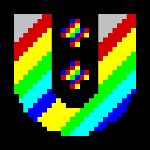
This is another logo I was experimenting.It is a bit hard to do it in 32 pixel but I managed to. Here is the result

[Updated on: Wed, 01 June 2022 16:11] by Moderator Report message to a moderator |
|
|
|
| Re: Logo Testing [message #58491 is a reply to message #58488] |
Wed, 01 June 2022 16:11   |
 |
 Klugier
Messages: 1100
Registered: September 2012
Location: Poland, Kraków
|
Senior Contributor |
|
|
Hello Sayem,
We do not need pixels in the framework/TheIDE logo. We need more fluent one without sharp pixel edges. Also, you could try to make it more natural. The transitions between colors should be more smooth. You could also consider making black and white logo. It is universal and works in all circumstances (black and white themes). Please focus on alternate TheIDE logo, we need refreshment there the most. Our current framework logo is fine.
Your logo looks like a pixel art  We are not targeting this style. We need modern design, not 80/90s stylized We are not targeting this style. We need modern design, not 80/90s stylized  You could use all available colors and you do not need to limit to 32. You could use all available colors and you do not need to limit to 32.
BTW, You could insert graphics to your post. After clicking "Upload File" there is an option to insert graphics to your post. The button will be alerted with "Delete" and "Insert image" options.
Klugier
U++ - one framework to rule them all.
[Updated on: Wed, 01 June 2022 16:19] Report message to a moderator |
|
|
|
| Re: Logo Testing [message #58494 is a reply to message #58491] |
Wed, 01 June 2022 18:03  |
 Sayem
Sayem
Messages: 21
Registered: May 2022
|
Promising Member |
|
|
Thank you for the suggestion of graphics option and more brief information about what the logo needs to be  It was experimental and it was halfly done few weeks ago. I made it fully for showcase. Like I said, it will take 2 months or more for the actual logo I have been trying to create. I made another logo which I created and sended to you in reply on the "Just to Show" Topic. You can see it. That was the concept. It was experimental and it was halfly done few weeks ago. I made it fully for showcase. Like I said, it will take 2 months or more for the actual logo I have been trying to create. I made another logo which I created and sended to you in reply on the "Just to Show" Topic. You can see it. That was the concept.
Thank you so much for the information. That is very less painful as I can do the actual logo without trying to see what it will look like in pixel.
[Updated on: Wed, 01 June 2022 18:04] Report message to a moderator |
|
|
|
Goto Forum:
Current Time: Tue Jul 08 02:07:49 CEST 2025
Total time taken to generate the page: 0.04362 seconds
|
