|
|
|
Home » U++ TheIDE » U++ TheIDE: CodeEditor, Assist++, Topic++ » Topic browser wishes [FEATURE REQUEST]
| Topic browser wishes [FEATURE REQUEST] [message #518] |
Fri, 06 January 2006 22:42  |
 hojtsy
Messages: 241
Registered: January 2006
Location: Budapest, Hungary
|
Experienced Member |
|
|
These missing features would be essential for a documentation browser:
- scrolling the text panel by keyboard
- copying selected text regions from the text panel
- search on current page
- search on all pages
- search by topic name
[Updated on: Wed, 03 May 2006 01:48] by Moderator Report message to a moderator |
|
|
|
|
|
| Re: Topic browser wishes [message #521 is a reply to message #519] |
Sat, 07 January 2006 11:54  |
hojtsy
Messages: 241
Registered: January 2006
Location: Budapest, Hungary
|
Experienced Member |
|
|
Could you tell the benefits of using a proprietary tpp format for documentation instead of html? I think html docs would be much more accessible to users. They could choose their favourite web browser, which already has all the fancy features such as for example multiple tabs or mouse gestures. A docs browser could still be provided as an alternative, which has multi-page search.
[Updated on: Sat, 07 January 2006 11:54] Report message to a moderator |
|
|
|
| Re: Topic browser wishes [message #522 is a reply to message #521] |
Sat, 07 January 2006 12:16 |
 |
mirek
Messages: 14039
Registered: November 2005
|
Ultimate Member |
|
|
Well, there of course is a lot of truth there...
However, whole thing begins with the QTF issue. In the beginning, we needed some rich-text format mainly to create reports of our database applications.
Well, real choices back then were:
- HTML
- RTF
- develop the format
Now:
HTML - problem is that HTML lacks complete typography, so it cannot be used there. It is also quite verbose and parsing is not trivial.
RTF - totally unusable if you are going to use it in code to create things (like programmatically create the table). Also, complete implementation is not trivial.
That left us (back then) with "develop the format".
Later we started to use the same format for e.g. dialog boxes (right now, almost any text in U++ GUI is QTF enabled - just prefix it with \1).
Even later we have created wordprocessor package and while it can in fact work with any format, QTF was the natural choice for the default one.
It is non-standard, but does its job very well.
QTF allows using Topic++ for creating application rich-text resources. Topic++ is multi-purpose tool; one of purposes is to create the help for the application or other document resources (like copyleft text in the About.. box of TheIDE). .tpp files can be directly compiled into the aplication, not external files are needed to ship with it (self-containment is one of goals we always tried to achieve with U++). See "reference/Topic" example.
As for HTML, the QTF->HTML conversion is trivial. The whole U++ website is generated by exporting .tpp files and all code documentation topics are there as well, so if you prefer HTML, just read the docs at the website.
|
|
|
|
|
|
|
|
|
|
|
|
| Re: Topic browser wishes [message #578 is a reply to message #518] |
Thu, 12 January 2006 21:46 |
hojtsy
Messages: 241
Registered: January 2006
Location: Budapest, Hungary
|
Experienced Member |
|
|
Here is an other problem with the topic++ editor.
The character layout within a line is uneven and very strange to look at. See in the partial screenshot I am attaching, that in the same line the distance between characters are changing. This makes it hard to read the text, because it needs more concentration to identify the real spaces. Could you fix it to make the distances between neighbouring characters visually equal, and not changing on a page?
By the way how do I hide all those dots which are displayed for spaces? And could you please also make Alt-Backspace hotkey for Undo, just like in the code editor?
[Updated on: Thu, 12 January 2006 21:47] Report message to a moderator |
|
|
|
|
|
| Re: Topic browser wishes [message #580 is a reply to message #579] |
Fri, 13 January 2006 00:08 |
hojtsy
Messages: 241
Registered: January 2006
Location: Budapest, Hungary
|
Experienced Member |
|
|
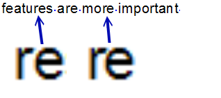
I copied together the same text & font as rendered by 1) RichText, 2) Ms Word, and 3) PhotoImpact.
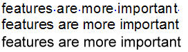
First I though that this example will show that RichText is uneven and MS Word is even. Then I noticed that the Ms Word also rendered the distance between "r" and "e" smaller in the "are". Still this seems much less noticable in Ms Word. For example I don't remember seeing anything in Word like the big distance between "n" and "t" in the "important".
[Updated on: Fri, 13 January 2006 00:11] Report message to a moderator |
|
|
|
|
|
|
|
Goto Forum:
Current Time: Fri Sep 20 10:11:59 CEST 2024
Total time taken to generate the page: 0.03346 seconds
|
|
|


 Members
 Pages
Pages Help
Help Register
 Login
Login Home
Home


")
