Layout Designer
Table of contents
1. Overview
2. Layouts management
2.1 Creating new layout
3. Adding widget to layout
4. Toolbar commands
4.1 Widget size scaling behavior
4.2 Order of widgets
4.3 Layout behavior settings
4.4 Assistance
4.4.1 Automatic code generation for layout
4.4.2 Jumping to class that implements layout
5. Adding support for custom widgets
6. Under the hood
1. Overview
Layout Designer is a tool that allows to create predefined views that can be directly used in application source code. It significantly reduces the amount of time needed to create the program. It separates logic from user interface. This allows to use some modern software architectures like MVC (Model View Controller). Despite the fact that user interface code with U++ can be written without Layout Designer its usage significantly speed up the application creation process.
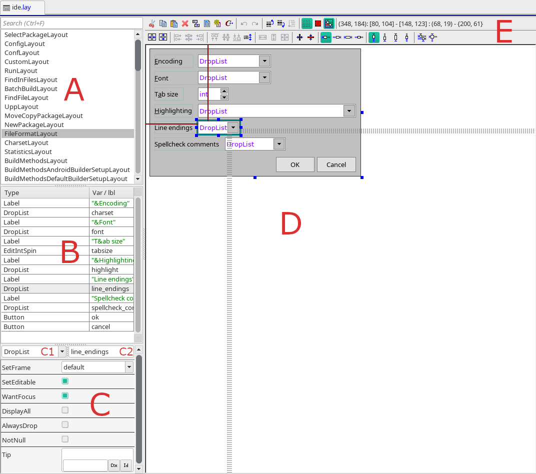
The layout designer consists of the following key elements:
A - list of layouts. One .lay file can contain multiple layouts.
B - widgets list associated with selected layout.
C - widget properties. They can be modified directly from layout designer..
C1 - widget type.
C2 - widget name.
D - layout view.
E - layout designer toolbar.
More information about using layouts in the source code can be found in the GUI tutorial.
2. Layouts management
2.1. Creating new layout
After creating a new layout file, it doesn't posse any layouts. To create layout right click on layout list and select "Add new layout.." or "Insert new layout..". The difference between these two options are the first one always insert at the end of the list. On the other hand the second will insert new layout before currently selected layout. Example below:
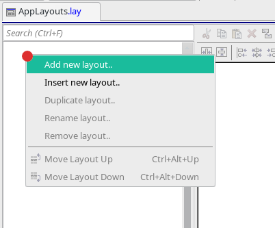
After selecting one of these two options, the dialog will appear. In the dialog in order to create a new layout the name must be provided.
3. Adding widget to layout
Adding new widget to the layout is simple. To do it right click on the layout view area and select concrete widget from the list. Example below:
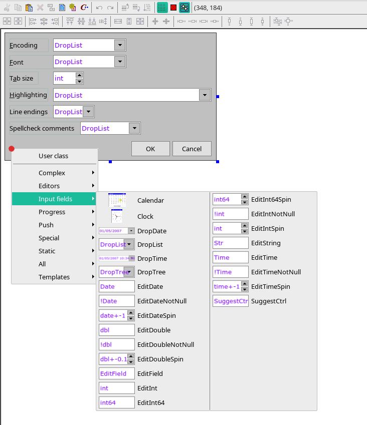
After that the widget will be placed on the layout view area. The initial position depends on the mouse position in which the menu has been invoked. The widget selection can be canceled by pressing Escape keyboard key or by left click on area that is not the widget selection menu. The whole system is intuitive and after few usage all problems disappear.
Standard U++ distribution bundles a dozen of widgets. They are mainly located in CtrlLib (Controls Library). All widgets definitions for Layout Designed are located in .usc files. The main one is located under the following path CtrlLib/CtrlLib.usc. If you plan to write .usc file by yourself the file is a treasury of knowledge.
To each widget category can be assigned. It is used to distinguish the widget within layout editor.
Complex -
Editors -
Input fields -
Progress -
Push -
Special -
Static - static widgets that do not offer any input.
All - all available widgets.
User class - this allows you to specify any widget that is within layout file include hierarchy. Very useful for all controls that do not have it's representation in .usc file.
The widgets available in the layout designer can be extended by using other packages not only CtrlLib. One of the package that extends the list is GridCtrl.
4. Toolbar commands
4.1 Widget size scaling behavior
Layout designer allows to specify how widget will behave upon layout size change. This will happen for example when user change window size on which given layout is placed. Upon selecting a particular widget by left-clicking on it, in the layout view the user should have access to the scaling options. This is show on the image below:
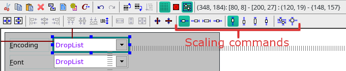
Let's analyze each option available in scaling commands:
Horizontal scaling:
 - widget size will do not change and it will stay on the left part of the layout. - widget size will do not change and it will stay on the left part of the layout.
 - widget size will do not change and it will stay on the right part of the layout. - widget size will do not change and it will stay on the right part of the layout.
 - widget size will adapt to the layout size from left to right. This is typical vertical auto resizing behavior. - widget size will adapt to the layout size from left to right. This is typical vertical auto resizing behavior.
 - widget size will do not change, however the widget will be placed by the horizontal center of the layout. - widget size will do not change, however the widget will be placed by the horizontal center of the layout.
Vertical scaling:
 - widget size will do not change and it will stay on the top part of the layout. - widget size will do not change and it will stay on the top part of the layout.
 - widget size will do not change and it will stay on the bottom part of the layout. - widget size will do not change and it will stay on the bottom part of the layout.
 - widget size will adapt to the layout size from top to bottom. This is typical vertical auto resizing behavior. - widget size will adapt to the layout size from top to bottom. This is typical vertical auto resizing behavior.
 -widget size will do not change, however the widget will be placed by the vertical center of the layout. -widget size will do not change, however the widget will be placed by the vertical center of the layout.
Predefined scaling:
 - the decision how to scale widget will be deduced by algorithm basing on widget type and it's current position. - the decision how to scale widget will be deduced by algorithm basing on widget type and it's current position.
 - the command resets to default scaling options for the widget. It will be set as left for horizontal and top for vertical. - the command resets to default scaling options for the widget. It will be set as left for horizontal and top for vertical.
4.2 Order of widgets
The order of the widgets in the layout matters. The widgets of the bottom of the list will be drawn first. It is very important when widgets overlap. Let's assume, non real world example. We have two buttons OK and Cancel and they are on the same position on the layout. The OK button is in the bottom of the list. The picture below presents the whole situation:
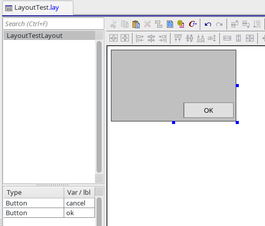
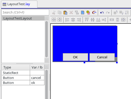
As we may see in this case only the OK button is displayed to the user. The bottom rule can be used to combine widgets and to create layers. For example on the top of the list you could place StaticRect with the color:
You could manipulate the order of the widget, by drag and drop or you could use ordering commands:
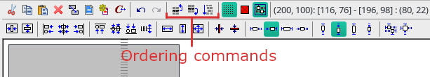
Let's discuss all of available options included in this group:
 - move widget one position into the top. - move widget one position into the top.
 - move widget one position into the bottom. - move widget one position into the bottom.
 - deduce the desirable widgets position on the widget list. More than one widget must be selected. When one widget is select, the option is disabled. - deduce the desirable widgets position on the widget list. More than one widget must be selected. When one widget is select, the option is disabled.
4.3 Layout behavior settings
There are three operations that defines how the work with the layout looks like.They are shown below:
Let's discuss each of them:
 -use grid while moving widgets. When enable the widget will be placed on the grid and while moving it could be only placed on the grid dots. The space between dots is set to 4 layout units. When disabled, the user have full control where to place widget with an accuracy of up to one layout unit. -use grid while moving widgets. When enable the widget will be placed on the grid and while moving it could be only placed on the grid dots. The space between dots is set to 4 layout units. When disabled, the user have full control where to place widget with an accuracy of up to one layout unit.
By default, the option is enabled.
 -ignore minimal size of the widget. In the .usc file there is an option to specify widget minimal size by overriding GetMinSize() method of ctrl: -ignore minimal size of the widget. In the .usc file there is an option to specify widget minimal size by overriding GetMinSize() method of ctrl:
// CtrlLib/CtrlLib.usc
ctrl ImageCtrl {
group "Static";
GetMinSize() { return Size(32, 32); }
When the option is enabled, above values will not be taken into account. So, the ImageCtrl could be smaller than 32x32 layout units. Where the first value represent height and the second width.
By default, the option is disabled.
 - automatically change size of the widget when layout size changed in the editor. This will respect the scaling behavior settings. When disabled the widgets will stay in their current positions. - automatically change size of the widget when layout size changed in the editor. This will respect the scaling behavior settings. When disabled the widgets will stay in their current positions.
By default, the option is enabled.
4.4 Assistance
4.4.1 Automatic code generation for layout
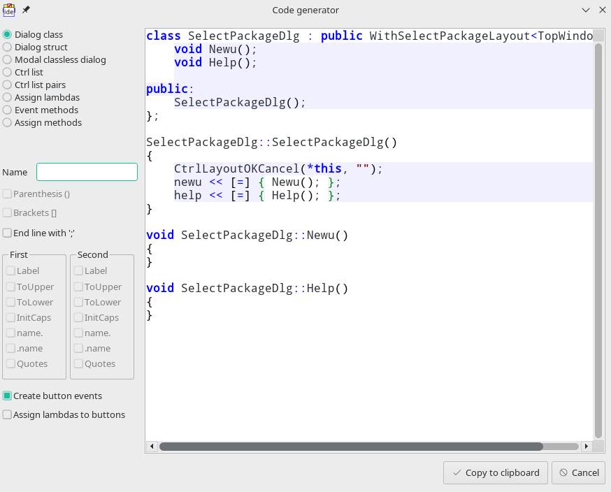
You could automatically generate code for your layout by executing "Generate code.." command. This will take into account only currently selected layout. The command is located in the following place:

This will open the window in which you could specify generation options and upon accepting copy the code to the clipboard. The dialog image below:
4.4.2 Jumping to class that implements layout
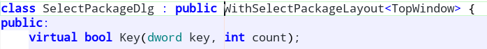
In order to jump to a certain class that implements layout in the code the following command should be used:

Let's assume that the layout is named SelectPackageLayout then after executing command the implementation file (.cpp) in the separate tab should be opened. The cursor will be placed in layout usage declaration. This command is very useful for big projects with multiple layouts. The place to which the command jumps is present below:
5. Adding support for custom widgets
For any widget Layout Designer support can be added. To do so .usc file should be created in the package where the widget source code is located. After that, in .usc file the code that describes widget should be added. There is lesson Creating and using custom widgets in GUI tutorial where the whole process is explained.
More information about the scripting language that is used by .usc file interpreter can be found here.
6. Under the hood
Under the hood the Layout designer operates on .lay file. It is text file that stores the collection of layouts. The exemplary layout store in that file looks as follow:
LAYOUT(ConfigLayout, 724, 214)
ITEM(Upp::ArrayCtrl, list, AutoHideSb(true).HSizePosZ(4, 4).VSizePosZ(6, 32))
ITEM(Upp::Button, ok, SetLabel(t_("OK")).RightPosZ(88, 80).BottomPosZ(4, 22))
ITEM(Upp::Button, cancel, SetLabel(t_("Cancel")).RightPosZ(4, 80).BottomPosZ(4, 22))
END_LAYOUT
|

