|
WheelRampCtrl : public Ctrl
Implements either color ramp or color wheel. Base class of ColorWheelCtrl and ColorRampCtrl. Widget implements usual SetData / GetData protocol where Value is Color.
Event<> WhenLeftDouble
Invoked when user double clicks the widget.
WheelRampCtrl& DarkContent(bool b = true)
If active, colors are displayed converted through DarkTheme function. Default is false.
WheelRampCtrl& AllowDarkContent(bool b = true)
If active, colors are displayed converted through DarkTheme function, but only if dark mode is active.
bool IsDarkContent() const
Returns true if colors are currently displayed as converted with DarkTheme function.
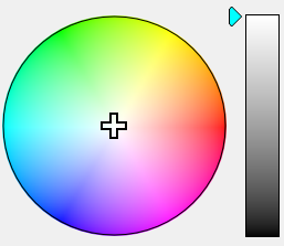
ColorWheelCtrl : public WheelRampCtrl
Color wheel widget.
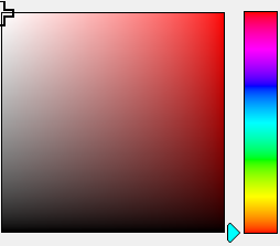
ColorRampCtrl : public WheelRampCtrl
Color ramp widget.
This class implements pop-up window for color-selection.
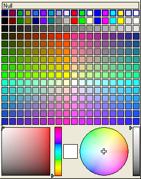
ColorPopUp calls WhenAction Ctrl callback and sets modify flag whenever selected color changes (that is during selection).
Derived from Ctrl
Opens ColorPopUp as pop-up window.
|
owner |
Owner Ctrl. ColorPopUp appears bellow or above this Ctrl. |
|
c |
Initial color for wheel and ramp selectors. |
|
Return value |
Returns current color selected. |
Adds the color to the list of recently used colors (see Hints).
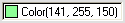
Setups whether Null (that is transparent) color choice is enabled. Constructor setting is NotNull(false).
|
b |
true disables Null color choice. |
Setups whether choice of system colors is allowed. Constructor setting is SColors(false).
|
b |
true enables choice of system colors. |
Setups text for Null color choice. Constructor setting for en-us is "(transparent)".
|
s |
New text for Null color choice. |
Enables special VoidColor() (labeled "(None)", unless the name is changed by VoidText).
Changes the label of VoidColor().
If active, there will be no color wheel nor ramp. Default is false.
If active, widget will contain a global list of recently used colors. Default is false.
If active, colors are displayed converted through DarkTheme function. Default is false.
If active, colors are displayed converted through DarkTheme function, but only if dark mode is active.
Returns true if colors are currently displayed as converted with DarkTheme function. .
This callback is invoked when ColorPopUp is canceled (e.g. by clicking outside).
This callback is invoked when color is chosen. Resulting color can be obtained by Get().
class ColorPusher : public Ctrl
This class represents Ctrl with Color value. It uses ColorPopUp to edit this value.
As is U++ standard, Color value is set and get using SetData and GetData virtual method.
WhenAction callback and modify set behaviour depends on track mode. When track mode is enabled (Track(true)), WhenAction is called and modify set upon any change of color (including moving mouse through ColorPopUp). When track mode is off, it is called and set only after new Color is selected.
Derived from Ctrl
ColorPusher& NullText(const char *s)
Sets a text to be displayed if Color value is Null. Constructor setting for en-us is "(transparent)".
ColorPusher& NotNull(bool b = true)
Setups whether Null (that is transparent) color choice is enabled. Constructor setting is NotNull(false).
|
b |
true disables Null color choice. |
ColorPusher& WithVoid(bool b = true)
Enables special VoidColor() (labeled "(None)", unless the name is changed by VoidText).
ColorPusher& VoidText(const char *s)
Changes the label of VoidColor().
ColorPusher& SColors(bool b = true)
Setups whether choice of system colors is allowed. Constructor setting is SColors(false).
|
b |
true enables choice of system colors. |
ColorPusher& WithText(bool b = true)
ColorPusher will display text representation of color (either known name, or numbers).
ColorPusher& WithHex(bool b = true)
ColorPusher will hexadecimal representation of color.
ColorPusher& Track(bool b = true)
Setups track mode. Constructor setting is Track(false).
|
b |
true enables track mode. |
ColorPusher& NoTrack()
Same as Track(false).
ColorPusher& NoRampWheel(bool b = true)
If active, there will be no color wheel nor ramp. Default is false.
ColorPusher& Hints(bool b = true)
If active, widget will contain a list of recently used colors. Default is true.
ColorPusher& DarkContent(bool b = true)
If active, colors are displayed converted through DarkTheme function. Default is false.
ColorPusher& AllowDarkContent(bool b = true)
If active, colors are displayed converted through DarkTheme function, but only if dark mode is active.
class ColorButton : public ColorPusher

This class is similar to ColorPusher, but intended to be used in ToolBar. It supports displaying color using Image too.
Derived from ColorPusher
ColorButton& ColorImage(const Image& img)
Sets image to display color. This image is drawn (in the center of ColorButton) with selected color.
ColorButton& NullImage(const Image& img)
Sets image to display null color.
ColorButton& StaticImage(const Image& img)
Sets static image that is always displayed with ColorImage and NullImage.
String FormatColor(Color c)
Formats the color into readable form compatible with C++ syntax, using color names where possible.
Color ReadColor(CParser& p)
Converts text formatted with FormatColor to Color. Can throw CParser::Error.
const Display& StdColorDisplayNull()
Returns Display which paints text "(no color)" if value is Null or paints the rectangle with value color.
|
